
Alguien ha comido letras?
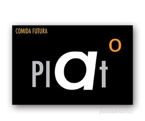
Ok. We had to do postcards for a restaurant. In the conceptualization came the question about, how to ilustrate food with the same letters than the word is written, and be legible at the same time. Why not the "eat" fonts? For me these 2, were the best ones of the 6 I developed.
First one: VASO = VASE and the second one PLATO = PLATE.
Comments